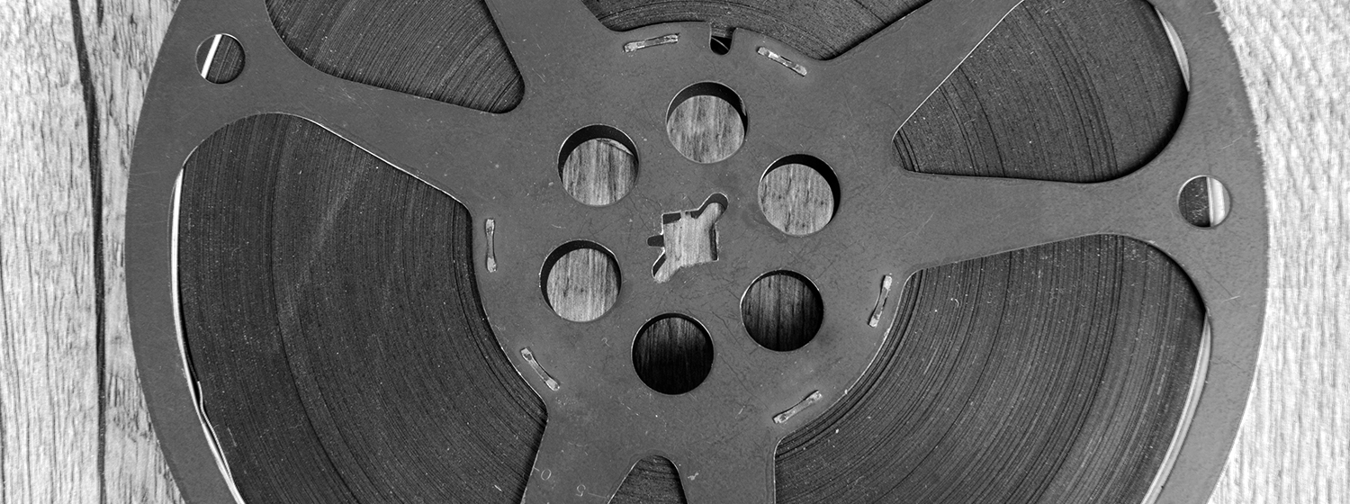
Recently we had the chance to hear Kyle Cooper speak about motion graphics. Kyle has been named one of Fast Company’s “100 Most Creative People in Business,” for the interactive motion graphic work he has done for various movies such as Sherlock Holmes and Spiderman.
Kyle’s work has transformed our movie-going experience. The high quality motion graphics he has created that appear at the beginning and end of a movie have made it essential for us to get there early and stay until the very end.
Kyle’s motion graphic pieces have become as (if not more) enjoyable that the actual feature length film. If a short interactive video can do that for a blockbuster, imagine the boost in engagement it could bring to your conference marketing.
When asked about the process when starting a new project, Kyle mentioned something that reinforces our thoughts on motion graphics and the strategy behind making them an effective piece for marketing communications:
“I do research. I listen to the director. I try to be an expert at the problem I am trying to solve. I try to find out everything I can about the movie, or the source material.”
Do Research & Listen to the Director
Your ability to do research is strengthened by having easy access to your target audience. Also, you can review our previous blog post about ways to collect feedback online.
The research you do should provide you with answers on how to engage, inspire and impact potential attendees. What are their interests and passions? What do they want from you? What problem can you solve for them? Answer those questions to tell a story. Motion graphics can dynamically bring your story to life, versus static pictures and text that are unchanging.
Don’t Forget Your Audience
Another takeaway from Kyle’s talk was a short mention of the purpose of each motion graphic project he completes:
“To make something that is not in the service of the film, is to not fully embrace the problem provided, and is a bit self-serving in my opinion.”
Just as his interactive short videos are designed to enhance feature length films like Sherlock Holmes, every communication piece from brochures to videos must be designed with the purpose of giving the target audience something they want/need. So, don’t add video to your conference marketing plan this year just because you think it is the cool thing to do. Instead, let your purpose to use video to solve a problem for your target audience, to inspire them or to give them something they want.
Little, three word statements can get you in trouble. Take “I love you”, for instance. Said too soon, too often, not enough, or not at all can sink a relationship. How about every kid’s favorite: “Clean your room!” An allowance might be withheld, a cell phone might be held hostage, or, in an extreme case, piles of stuff might be shoveled in the trash can if mom’s forceful request is ignored.
Then there are the three word statements that cause you to do the exact opposite of their intention. “Walk, don’t run!” is a command that is pretty much impossible for little kids to obey when they’re excited. “Nothing new here” and “Pay no attention,” on the other hand, immediately piques curiosity. Obviously, you are hiding something and I’d like to know what. Telling Dorothy and her friends to pay no attention to the man behind the curtain didn’t work for the Wizard of Oz after Toto unveiled him, and it won’t work for you either.
Finally we come to “Save the date,” a favorite of event planners. Use that often? If you do, cease, desist, stop immediately! Those are probably the three most overused words in event planning, and using them is the best way to make a bad first impression.
Think about it: you have 3 seconds to make a good first impression. Three! A quick glance is all a person needs to form an opinion. Once that impression has been made, it’s nearly impossible to undo. Show up for a first date in a favorite outfit that makes you feel like a million bucks with your hair and makeup just so and a huge smile plastered to your face, and you are already one step towards a second date. Enter the shabby, dreary lobby of what was billed as a boutique hotel, and you might walk right out and seek accommodations elsewhere—and then tell the readers of Yelp, TripAdvisor, and Zagat about it.
Save the date notices that simply list the date and venue are tired, overused, and totally ineffective. They immediately send the message that there’s no need to rush, no need to do anything right now, no need to take action because more information is coming…eventually. Your save the date notice is glanced at, tossed, and forgotten. What kind of first impression is your “save the date” notice making for your organization’s big event?
Whether you are attempting to make a good first impression in your career or social life, it’s very important to know how to create one every time. This article will provide a few useful tips on how to do just that when planning an event. As they like to say, a picture is worth a thousand words. With extra thought and preparation, your picture—or event marketing materials, in this case—could be worth a thousand and one words.
The First Impression
In this day and age, everything is interactive. To grab someone’s attention and leave a really great first impression, you need to wow them, engage them, get them talking. Social media is everywhere these days, and for good reason. With it, you can start a conversation with your audience, whoever and wherever they are. People are not numbers anymore; they’re not a boring set of statistics and demographic information laid out in a chart. They’re individuals with personalities, and you want to offer them substance, value, excitement and a positive impression of your brand.
Making a good first impression relies on three little rules rather than three little words. When you are planning an event, your marketing materials must:
Promote the event’s value
Inspire the unaware
Enhance the brand
Promote the event’s value
Use common sense when making that first impression. You need to answer these important questions: Why should I attend your event? What new things will I learn, see, do? What is available to me at this event that I cannot find or get elsewhere? Basically, what’s in it for me?
Inspire the unaware to attend
Be thought-provoking and inspirational in your messaging, especially during these days when everyone is doing more with less: less time, less people, less money. Make a strong argument for why someone should leave the busy day-to-day of their jobs to go to your event. What will be new, fun, interactive, a once-in-a-blue-moon experience? How was last year’s event such a smashing success, and what will make this year’s better?
Enhance the brand
Put on your strategy hat and remember that you’re not selling an event, you’re selling an entire brand experience.
You’re event adds value to your brand, and you’re putting on this event so members will think more highly of your brand.
After all, your ultimate goal is to ensure attendees become members, renew their membership, or increase their donation, not because you like to throw a big party.
This is a great quote that I read somewhere, and I am sorry I don’t remember where, but it’s very apropos to this discussion: “Your event should be a memorable experience that adds value to your brand, but if your first impression is of the same old-same old, then what is that really doing?”
You need to do something new, so break out of your box, ditch the playbook, and approach your event with fresh eyes. Armen Gharabegian, CEO of Design Ethos in LA, contributed some relevant advice in a column that appeared in Corporate Events Magazine. He really stressed the impact your event has on your brand. We couldn’t agree more. If the marketing materials you use before, during, and after the event look the same every year, your organization looks irrelevant, out of touch, stodgy, and boring. But don’t just focus on the design and how your brand looks; the content matters even more. Your marketing materials must resonate with people and tell your brand’s story.
Gharabegian also urges you to think about the key takeaways of your event: How will you get your attendees to remember the information you are sharing with them? Encircle your attendees in messaging that drives home those points. What emotions do you want to trigger? Go beyond a new look and message in your signage and staging; take it to the flooring, seating, walls, ceiling. Incorporate everything into your branding efforts.
Making a great first impression while planning your event starts with thought, preparation, and relevance. In those three, very fast seconds someone spends glancing at your event marketing materials, pull out all the stops to grab their attention. By adding inspiration, excitement, and value, and your brand will grow and flourish.
When we were growing up, Disney movies were a really big deal. Everyone, kids and adults, flocked to the theatre to see the latest masterpiece, whether it was live-action or animated. We knew it would be entertaining, well-acted or beautifully drawn, and packed with great songs. We also knew parts would be sad, some more than others. (We still can’t get over Bambi’s mother dying or the heartbreak of Simba when he thought he was responsible for his father’s death.) Despite the dark bits, Disney movies were, and still are, wholesome, universal, and universally loved.
In 1995, family movies—and movie-making—changed forever when a new animated movie studio named Pixar Animation popped up on the radar. Instead of employing hand-drawn animation in their movies, they used the then-cutting edge technology of computer animation. As we all know, their first movie, Toy Story, was a smash hit; the rest, as they say, is history. Personally, I enjoy the Pixar movies a lot more than Disney movies, thanks to the adult humor that is snuck in on the sly. It sails right over kids’ heads to land on ours with a satisfying, laugh-til-our-sides-hurt thump.
The studio, originally a division of Lucasfilm that was spun off in the 1980s, was founded by John Lasseter, Steve Jobs, and Ed Catmull. For 10 years, they made short films and commercials. Beginning with the runaway success of Toy Story, their full-length feature movies now make zillions of dollars. If you have kids, you have seen some or all of their movies, including Wall-E, Up, Ratatouille, Cars, The Incredibles, Finding Nemo, Monsters, Inc., and A Bug’s Life, as well as the three Toy Story movies.
Because our Rottman Creative team urges our clients to think differently and try new things, we love to cheer on others who do the same. Pixar is the poster child, so to speak, for new and different and better, and we love them for it. When you think about it, their achievements are truly mind-boggling. They swung for the fences and scored a game-ending, triple-hit that brought the house down. To fully appreciate their genius, watch the excellent documentary film, The Pixar Story, which follows Pixar’s meteoric rise and continued success (thanks to tremendous amounts of determination, perseverance, and perfectionism).
We found the movie to be inspiring on so many levels, which is why we wanted to share it with you. From the revolutionary processes they invent and employ to the out-of-the-box thinking to the incredibly hard work that is put into each mega hit they produce, the film just leaves us in awe every time we watch it. As we learned in the movie, one of the reasons for their success is their fanatic attention to detail and quality. That’s why they don’t make a bad movie—lesser stories are either re-worked til they’re right, or junked.
For movie fans, it really is a treat to see how the company works. The filmmaker, Leslie Iwerks, follows John Lasseter’s career, from his time as an animator with Walt Disney, including the run ins and a firing that turned out to be for the best. He and his team at Pixar faced enormous pressure to succeed, and as a result, they made tremendous personal sacrifices. The movie boasts tons of archived footage, much of which had never been shown before, and numerous interviews with the creators, CEOs past and present, and the stars who gave voice and personality to the movies’ characters.
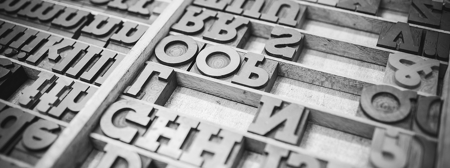
Unless you are in design, you probably don’t pay much attention to the huge array of typefaces that you come across every day. From the different fonts used in emails to road signs to ads to packaging, design is everywhere. You don’t even have to look for it. It’s just there, on everything, for all of the world to see.
You probably do notice typefaces, though, even if you don’t think you do. If you’ve ever had to pick out a wedding invitation, birth announcement, or party invitation, you’ve had to think about what kind of typeface to use. Modern? Traditional? Classic? Should the words be italicized? If your favorite magazine suddenly redesigned its look, it probably chose new typefaces, too. Same thing when a food manufacturer redesigns its packaging. New typefaces stare at you from your kitchen cabinets.
Because graphic design is such an integral part of what we do at Rottman Creative, we notice it, we enjoy it, and sometimes we are surprised and delighted by it. Sometimes we even fall in love with it. We have been known to slow down while driving to look at signs, to double-back on the sidewalk to admire a shop’s name, to save brochures and other pieces of collateral because we so admired their typeface and layout.
I don’t know if we would make a movie about typefaces, but lucky for us, filmmaker Gary Hustwit did. Helvetica is a feature-length documentary about the iconic, modern, and popular typeface of that name (which is based on the Greek word for Switzerland). I can guarantee you’re familiar with it: storefronts, street signs, public transit systems, government forms, ads, and many, many other organizations and industries use it. Developed in 1957 at the Haas Type Foundry in Munchenstein, Switzerland, it was described in a New York Times movie review as “an emblem of the machine age, a harbinger of globalization and an ally of modern art’s impulse toward innovation, simplicity and abstraction.”
The film, which premiered in 2007 and won numerous awards, is absolutely fascinating. In fact it’s one of our favorite movies. Just as Helvetica has had a huge influence on the way we look at things (literally), it has influenced us on a personal level by reminding us to not take creativity for granted. What we truly love about the movie, though, is that it’s not just about the Helvetica typeface. It’s really more about graphic design, culture, the creative process, urban spaces, advertising, psychology and the huge impact typefaces have on our lives. The movie is full of insightful interviews with graphic designers and theorists, some of whom lavish praise on Helvetica, some of whom deride it as too common and ubiquitous. Watch the trailer to see Helvetica used here, there, and everywhere. Better yet, rent the movie. Then decide which side you agree with.
On the Helvetica website, you can buy not only the DVD or BluRay disc, but also t-shirts, the movie poster, tote bags, and other prints. Perfect gifts for the graphic designer in your life! But you need not be in advertising, marketing, or graphic design to appreciate the movie. If you appreciate popular culture, modern design, the ways things affect us when we don’t even realize it, you’ll like the movie. Or maybe even love the movie, just like us.
As designers, we appreciate the power of white space. It gives artwork impact, makes text readable, and invites the viewer inside. In fact, we even named our newsletter WhiteSpace, so we were intrigued to read Wendy Richmond’s riff on the topic in the 2010 Interactive Annual. Richmond compares white space to those gaps in a writing instructor’s syllabus where the instructor creates an awkward void, encouraging students to critique each other’s work.
We’d liken white space to the gaps a composer uses to build suspense. When a musician follows the composer’s direction and observes the rests, those silences enrich the other notes to dramatic effect. Ever sat in a concert hall when the entire orchestra pauses in unison before the final chord? The audience holds its breath in anticipation, then explodes into applause after that last crucial note.
White space serves a similar purpose. Some clients want to cram as much information on a single webpage or a brochure as possible, but the result can be overwhelming to the audience. Look at the margins on this blog. If the text blended right into the images, then neither text nor images would be very effective (or visually pleasing).
Similarly, if a logo doesn’t have a little breathing space, then it’s harder to process. Give it a little more space and suddenly it appears to jump right off the page (or screen).
But we’re not about to just insert white space for the sake of having white space. These voids should be used purposefully. They need to be part of the overall design concept and strategy. And since we’re all about helping associations and nonprofits improve their communication strategy, it’s only fitting that our WhiteSpace newsletter reflects this approach.
The Internet has made it very difficult for artists and other creative types who produce original songs, paintings, photos, movies, books, graphics, and other materials to fully protect how their work is accessed. Remember when Napster introduced mass file sharing? It practically caused movie and music execs to have a collective nervous breakdown. In less dramatic fashion, copyright infringement is still—and will remain—an issue, mostly due to the power of search engines and the ability of websites to so easily link to each other.
Communication Arts recently ran a very interesting article by Tad Crawford and Arka Chatterjee that addressed copyrights and the internet. They looked at the effect of thumbnail images, frames, linking, and deep linking on copyrights. If your company or organization does not yet have policies in place to prevent copyright infringement from happening, it might be time to put some together.
Thumbnails
Search engines, like Google, Yahoo!, and Bing, often display thumbnails (small, low resolution images) of photos, paintings, and other images on search results page. Two recent lawsuits have challenged this practice by claiming copyright infringement. Judges in both cases found in favor of the search engine companies.
In the first case, Kelly v. Arriba Soft, photographer Leslie Kelly sued Arriba Soft, claiming that their Ditto.com search engine was infringing on his copyrighted photos by displaying thumbnails of his work on its search results page. The court found that because Arriba was not profiting from Kelly’s work, but rather was displaying his photos for relevant web research purposes, the use of the images were fair. The second case, Perfect 10 v. Amazon.com, was very similar to the first; it concerned Google’s image search feature. This feature allows users to click on the thumbnail in the search results list to view the full-size image. A judge found that though Google was usurping Perfect 10’s distribution rights, its image search feature was being used in fairness.
As these examples show, balancing licensing and copyrights with the exposure gained from having one’s work easily found online is tricky. You don’t want to lose money on your work, but being able market your work globally can be a huge benefit, especially for young artists, many of whom struggle in obscurity.
Linking and Framing
In the SEO world, you are encouraged to link your site to others and vice versa. What if your site links to another that contains infringed material? The Supreme Court settled just such a lawsuit: Metro-Goldwyn-Mayer Studios v. Grokster. Grokster, a peer-to-peer file sharing service, was found liable for copyright infringement for directing users to unlawfully copied media content. Of course, Grokster was providing links to movies on purpose, but be careful about inadvertently linking to protected content.
Framing is similar to linking, and it also presents an infringement problem. Framing happens when a web portal links to a web site and displays that site’s content in a frame; the frame’s edges typically include ads that benefit the portal. It has been successfully argued that framing website content is copyright infringement, as in the case of the Washington Post v. TotalNEWS. The Post accused TotalNEWS of framing their content, and the judge ruled in favor of the Post. In another case, Wells Fargo Bank sued WhenU.com for displaying pop-up ads on its site that advertised competing brands. Wells Fargo successfully argued that their website was being “framed”.
Deep linking
Deep linking occurs when Website A links to content within Website B without acknowledging Website B’s entitlement to profits from the content; for instance Website B depends on advertising revenue, but the ads are bypassed by the link. Even worse, it often appears that Website A is the originator of the content. Tickets.com, a clearinghouse for concerts, shows, and other events, was accused by Ticketmaster of using a web crawler to pull information about concerts and shows off its website to post on Tickets.com. A judge found that Tickets.com was acting fairly, as the concert information was public information and therefore not protected by copyright.
While everything we create is copyrighted, once we post our original work to our website it can be considered public information.
As long as no one else profits from displaying or linking to it, it can appear on search engines’ results lists and be linked to by other websites. If you are not comfortable with losing control over how your work is viewed, be careful of what you post online.
For years, motion graphics have been a fixture in cities like New York and Tokyo, creating a sense of urgency, excitement, and constant motion. Now we’re seeing static images replaced by animated images on airport posters, shopping mall signs, bus stop ads.
That sense of motion creates a much stronger impact than still images alone.
When executed properly, it conveys information simply and seamlessly, especially for people who don’t have the time or inclination to read big blocks of text. In fact, we believe every offer should include video or motion graphics.
These moving elements make your offer feel current and relevant. With the popularity of YouTube.com, it’s easy to distribute viral videos through your website and social media channels. And programs like Dragon Stop Motion simplify the process of creating high-quality animation. These graphics can then be incorporated into a variety of marketing pieces, including email campaigns, web pages, and in-person advertisements.
Videos and motion graphics are a highly effective way to distribute information.
In fact, a recent study conducted by comScore and VideoEgg found that rich media video ads were more engaging and more successful at tipping the sales needle than traditional banner ads. No surprise there, but it’s interesting to note that the study also found that this was true regardless of the context in which the ads was displayed.
However, the old adage “less is more” certainly applies to motion graphics. Try to do too much in a single motion graphic and it can detract from your main message, creating confusion. With each motion graphic, we focus on what that graphic should achieve. Will it entice? Educate? Or complement and enhance the surrounding text?
We predict that motion graphics will become even more prevelent as part of marketing campaigns in the future.
You’ve created a brand identity for your association that seems to be working. Members recognize your logo when they see it on tote bags or postcards. They’re happy to refer colleagues and renew their own memberships.
Think your job is done? Think again!
In a recent newsletter, we mentioned the need for brands to change and evolve as the marketplace changes.
The ultimate example of brand evolution is Madonna, whether or not your a fan. Over the last twenty-five years, she’s gone from “Material Girl” to Marilyn Monroe lookalike to children’s book author to pop icon. While many eighties rockers are relegated to the bottom of people’s CD collections, Madonna remains relevant and in the public eye decades later.
But you don’t need such an extreme makeover to keep your brand current.
Just look at Apple. Their logo is iconic, and it’s undergone several redesigns since the mid-seventies. Remember that rainbow-striped apple they used between 1976 and 1998? It made sense because its color graphics were one of Apple’s main selling points. Now the company is known for the slick, streamlined appeal of the MacBook and iPhone, so their new logo reflects this new identity.
Brand enhancements like tweaking or simplifying your logo can improve your brand, but they’re not a cure-all.
Your association itself needs to evolve as well: for instance, getting involved in social media and facilitating two-way communication with members.
With strategic changes over time, you ensure that your association continues to grow alongside its members and maintain relevancy.